jekaduran9@gmail.com | Tel: +34 689978454

Grip
Landing page redesign | Science page | About us page
UX
UI
Branding
Illustration
Summary
-
The goal was to redesign the landing page to be consistent with our social media.
-
As a result, I reconciled the website look-and-feel with our design system and redesigned 80% of all the pages.
Tools
Confluence
Google Analytics
Figma
Procreate
Canva
Trello
Illustrator
Wix
1. Science page re-design
UX
UI
Branding
Illustration
Goal
-
Create a complete interface with enough information so that the user can understand more about the hormones we test.
-
Understand and analyze the research that my team members have already done and find an easy way for the user to transmit the information correctly.
-
Re-design the previews science page.
-
Reduce bounce rate.
-
Have a consistent visual style.
Process
-
First let's start asking ourselves, what is the goal of the science page? This page is one of the most viewed since it explains how grip works, what hormones we test, and we talk a bit about science. But we always received questions for the users about hormones, and we realized that the page was very confusing for the client, talking about these types of topics and science is often difficult to understand.
Insights
-
The lack and confuse information.
-
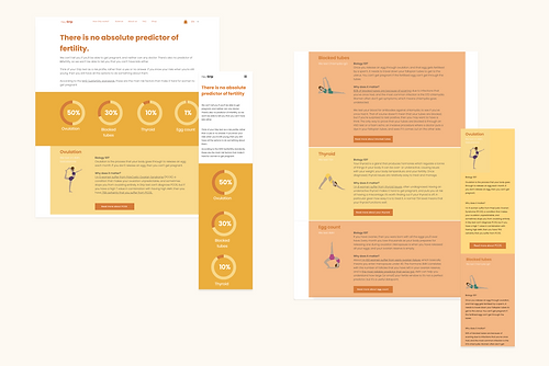
The images with the percentage numbers are not clear, users do not understand where that data comes from.
-
Yoga illustrations have nothing to do with the explanation of hormones
-
There is no call to action to make a purchase
-
Lots of information for mobile, for desktop it works fine.
-
Inconsistency in visual style.
Prototyping and wireframing
-
With the information already collected, I started with a low fidelity prototype to define the sections that were going to go on the science page and what information was necessary for the user.
-
After asking for feedback and making some changes, The next step was to see if the design on lo-fi could be implemented in Wix.
-
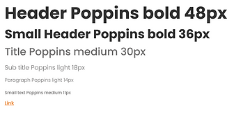
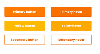
With the system design, I defined what color palette I was going to use, components and typography in order to have consistency in the design and continue with the DNA of Grip.
-
Collect inspiration and references for the new design.

Design System


2. About us page re-design
UX
UI
Branding
Goal
-
Re-design the previews science page.
-
Connect and empathize users with the history of Grip and with its founders
-
Have a consistent visual style.
Improvements
-
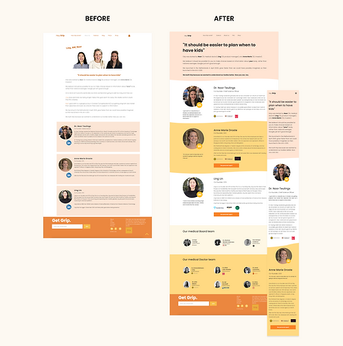
I changed the photos of the founders to make it look more professional.
-
I added a new section called "our doctors" showing doctors with their LinkedIn in so users can see their background and work.
-
Added the icons of the founders' jobs, universities and jobs to give more trust.
-
I added a button that redirects to the results of the fertility test of the founders.
