jekaduran9@gmail.com | Tel: +34 689978454

Grip
Shop page optimization
UX
UI
Research
Branding
Goal
-
Increase the conversion of the shop page by creating a clear differentiation between the two different tests Grip has to offer
-
Ensure that the user has all the necessary information to improve the shopping experience and make the decision to buy the Grip test.
-
Lower the bounce rate of the shop page
-
Improve the visual style of the shop page
-
Create a mobile-friendly experience on the shop page
Tools
Confluence
Google Analytics
Figma
Hotjar
Trello
Wix
1. Research
-
I started doing a general analysis of the previous shop page, looking at what is working and what is not currently working, and what could be quickly improved in terms of design. For this project, I created confluence documentation to collect all the information during the UX process.
-
Checked the Google analytics data of the previous purchase page for reference before and after the redesign of the page. These data are from Jun 1, 2021 - Jul 31, 2021 (before the Shop page redesign)
4,608
Page views
3,797
UniquePage views
01:36
Avg. Times on Page
47.31%
Bounce Rate
-
Then, I did a Competitive benchmark against our direct competitors and looked at how their buy experience worked, what they had, and what we could also implement. The outcome is summarized below:

“
-
After that, I collected information, documentation, and previous research and user interviews made…. from the confluence of my colleagues.
“
“Oh, how annoying! I must say that I am very sorry that (in my opinion) that was not clearly indicated at the time. Because that's the very reason I bought the test. Now I still have to take other tests to find out and I wanted to do that precisely this way.”
(Currently, in Grip there are two fertility tests, one if you are on birth control and the other test if you are not on birth control, and each test tests different hormones) This customer thought we were going to assess her risk for PCOS, but she bought other test because she did not have enough information and was confused about buying the right test for her.
2. Insights
-
Remove the quiz on the shop page
-
We have two tests, but there is no clear difference in what each one does.
-
It’s not clear why one kit is more expensive than the other
-
The lack of information about the tests makes the purchase process delayed and in many cases unsuccessful.
-
The CTA is not visible.
-
Each kit should have a different name so that they can be easily differentiated.
-
Add an explanation about each test and have different photos per test.
-
There were too many steps and clicks involved to finalize a purchase.
-
There were many clicks before making the purchase. There was the purchase page where the two kits were, if you clicked on the product, it would redirect you to the product page and finally the purchase was made.
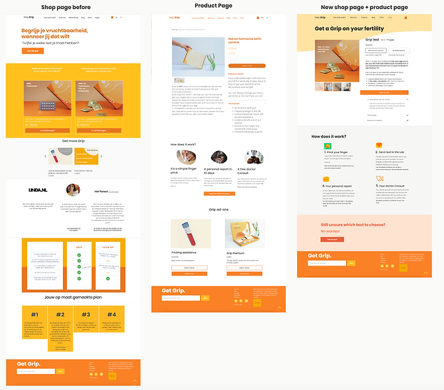
3. Prototyping and wireframing
-
I started to make a paper prototype with the insights that I collected with the competitive analysis and the previous research, I defined which sections were going to go on the shop page. and then start the low fidelity prototype to show to the team and see
-
The next step was to see if the design I made on paper could be implemented in Wix and start prototyping in Figma and iterating.
-
After doing some prototypes, we decided to mix the shop+product page to minimize the clicks for the user. And the best way to do was to create just one shop page with the full information for each test and the add to cart button.
-
Collect inspiration and references for the new design.
-
Design and implement the final UI on Wix
4. Success metrics
-
These data are from Google Analitycs 1, 2021 - Oct 31, 2021 (After shop page redesign)
01:06
Avg. Times on Page
42,31%
Bounce Rate
5. Results
-
The conversion rate never went below 1%.
-
Reduced bounce rate by 5% in comparison to the old shop page.
-
Reduced the number of steps involved in a purchase from 5 to 2
-
Reduce the average time on the page.
-
Increase visits to the page
-
Unified Style
-
Improved the design and layout.
6,972
Page views
5,635
UniquePage views
Next steps
-
After releasing the new version I monitored Google Analytics and Hotjar during 2 weeks to check that the changes had a positive effect.
-
Continue iterating.